
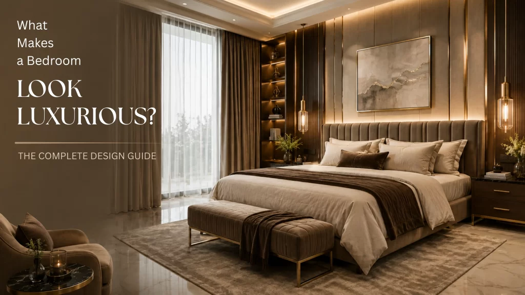
You’ve scrolled through hundreds of bedroom photos by now. Some stop you mid-scroll — calm, expensive-looking, almost hotel-like. Others, despite costing just as much, feel flat. The furniture might even be similar. So what’s actually going on?
The answer isn’t a bigger budget. Good luxury bedroom interior design is a system — a set of decisions about layout, light, material, colour, texture, and proportion that work together instead of competing. Once you understand the system, you stop guessing and start designing on purpose.
This guide walks through every part of that system, in the order the questions actually come up.
What Actually Makes a Bedroom Feel “Luxurious”?
Strip away the price tags and luxury comes down to five things, consistently, in every high-end bedroom you’ve ever admired:
- Restraint — fewer objects, each one intentional
- Consistency — one clear material and colour story, not five competing ones
- Layered light — never a single overhead bulb doing all the work
- Tactile richness — surfaces you want to touch, not just look at
- Correct proportion — furniture and decor sized properly for the room
Notice that none of these require a specific brand of furniture. A rented apartment with the right proportions, decent lighting, and two well-chosen textiles will out-perform a room full of designer pieces arranged without a plan. That’s the whole secret behind good luxury bedroom interior design — it’s a discipline, not a shopping list.
Does Luxury Depend on Room Size or Layout?
No — but layout decides whether a room reads luxurious or cluttered, regardless of square footage.
Three layout principles show up in almost every high-end bedroom:
- The bed is the anchor, not an afterthought. It sits on the wall that gives it the most visual weight — usually opposite the door or centred on the longest wall — with equal breathing room on both sides.
- Negative space is protected on purpose. Luxury rooms have visible floor and wall space that isn’t doing anything except letting your eye rest. A cramped layout signals “budget,” even with expensive furniture in it.
- Traffic flows in a straight, unbroken line. You should be able to walk from the door to the closet, or the bed to the bathroom, without turning sideways around furniture.
If your room is small, the fix isn’t smaller furniture crammed everywhere — it’s fewer, correctly-scaled pieces with more space around each one. A queen bed with 24 inches of clearance on each side feels more luxurious than a king bed with none.
How Important Is Lighting in Luxury Bedroom Interior Design?
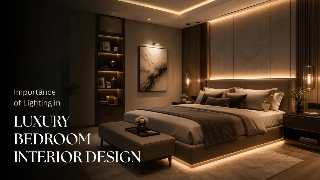
This is the single most underrated factor, and it’s also the cheapest to fix.
Every luxury bedroom you’ve admired is using at least three separate light sources, each doing a different job:
- Ambient light — general room illumination, ideally dimmable and warm (2700–3000K), never a bare overhead flood
- Task light — bedside lamps or wall sconces at the right height for reading, roughly 20–26 inches above the mattress
- Accent light — a picture light, LED strip behind a headboard, or uplight on a piece of art that creates depth after dark
A single ceiling fixture, however expensive, will always look flatter and cheaper than three modest, well-placed lamps working together. Layered lighting is also why hotel rooms feel instantly upscale — they almost never rely on one overhead source.
If you do nothing else from this article, swap your bulbs to warm white and add one bedside lamp with a dimmer. It’s the highest-impact, lowest-cost change in this entire guide.
What Materials Are Used in High-End Bedrooms?
Material choice is where luxury bedroom interior design becomes most visible to the eye. Luxury materials share one trait: they age well and feel intentional, not disposable.
| Category | High-end choice | Budget swap that still works |
| Bedding | Long-staple cotton, linen, silk-blend | Percale cotton (300+ thread count) |
| Flooring | Solid wood, natural stone, wool rug | Wide-plank laminate + a dense wool-blend rug |
| Walls | Limewash, textured plaster, grasscloth | Matte or eggshell paint in a warm neutral |
| Hardware | Solid brass, matte black steel | Powder-coated metal in the same finish family |
| Wood tones | Walnut, oak, ebonised wood | Consistent laminate in one wood tone only |
The pattern in that table matters more than any single item: consistency of material family beats individual expense. One warm wood tone used throughout looks richer than three different woods mixed together, even if each one was expensive on its own.
Which Furniture Pieces Actually Define a Luxury Bedroom?
Furniture is often where people overspend without understanding luxury bedroom interior design principles first. You need fewer pieces than you think — but each one has to earn its place.
- A substantial headboard — upholstered, channel-tufted, or solid wood. This single piece does more visual work than any other item in the room.
- Matching nightstands, correctly sized — the tabletop should sit roughly level with, or an inch or two above, the top of the mattress.
- One statement seat — a bench at the foot of the bed or a reading chair in the corner. This is the piece that separates “furnished” from “designed.”
- A dresser or console with clean lines — ornate carving reads dated faster than simple, well-proportioned silhouettes.
- Nothing that doesn’t have a job. Every extra side table or unused chair dilutes the room. Luxury spaces have less furniture, not more.
What Colour Palettes Look Luxurious in a Bedroom?
Colour is one of the most misunderstood parts of luxury bedroom interior design. Luxury palettes are almost always low-contrast and warm-neutral based, with one deliberate accent — never five competing colours fighting for attention.
The formula that shows up again and again:
- 70% base neutral — warm white, greige, soft taupe, or clay on walls and large furniture
- 20% supporting tone — a deeper shade of the same colour family, used on bedding or an accent wall
- 10% accent — one saturated colour or metallic (deep green, terracotta, brushed brass) used sparingly in decor or textiles
High-contrast, cool-toned rooms (stark white walls against jet black furniture, for instance) can look sharp, but they read as modern rather than warm — and warmth is what most people mean when they say “luxury.” If in doubt, choose tone-on-tone over contrast.
Why Do Textures Matter So Much in Luxury Interiors?
Because in a low-contrast, neutral-heavy palette, texture is doing the job colour usually does — it’s what keeps the room from looking flat or unfinished.
A genuinely rich-feeling bedroom mixes at least four textures in the same space:
- Something soft — a wool or shearling throw
- Something woven — a linen or boucle chair
- Something smooth or reflective — a lacquered nightstand, glass lamp base, or brass fixture
- Something matte and heavy — a stone lamp base, ceramic vase, or a thick wood frame
Rooms that feel cheap almost always have the opposite problem: everything is the same texture — usually smooth, shiny, or synthetic — with nothing to create depth when the light hits it differently through the day.
How Do Proportions and Scale Affect the Luxury Feel?
Undersized furniture in a large room, or oversized furniture in a small one, is the fastest way to make an expensive piece look wrong.
A few rules of thumb worth memorizing:
- Art above the bed should span roughly 60–75% of the headboard’s width — not a small frame floating in a sea of wall.
- Rugs should extend at least 12–18 inches beyond the sides of the bed, ideally reaching the nightstands.
- Curtain rods should be mounted close to the ceiling, not directly above the window frame — this alone makes ceilings feel taller.
- Lamp height, measured from the tabletop to the top of the shade, should land roughly at eye level when seated in bed.
None of this costs extra money. It’s simply measuring before you buy, which is exactly what separates a professionally designed room from a furnished one.
What Are Timeless Choices vs. Trendy Ones?
This matters because a room built entirely on this year’s trend photographs beautifully once and looks dated within two years — the opposite of what luxury is supposed to feel like.
Tends to age well:
- Neutral, warm palettes
- Natural materials (wood, stone, linen, wool)
- Upholstered headboards in solid colours
- Classic silhouettes (Chesterfield curves, simple Parsons legs)
Tends to date quickly:
- Very saturated accent walls
- Furniture tied to a specific decade’s silhouette (e.g., ultra-glossy 2010s lacquer)
- Novelty prints or heavily patterned statement walls
- Trend-driven metallics used everywhere instead of sparingly
The safest approach used by most designers: keep the big, expensive, hard-to-change items (bed frame, flooring, wall colour) timeless, and save trend experiments for the cheap, easy-to-swap layer — cushions, throws, and small decor.
Mistakes That Make a Bedroom Look Cheap Instead of Luxurious
These are the small errors that quietly undo good luxury bedroom interior design work, even when the bigger decisions were right.
- Mismatched metal finishes — brass lamp, chrome handles, and black curtain rods in the same room reads as random, not curated.
- Overhead lighting as the only light source.
- Furniture pushed against walls with no breathing room, even in small rooms.
- Too many decorative objects — a nightstand crowded with five items looks busier and cheaper than one with a lamp and a single object.
- Bedding that doesn’t reach the floor or drape properly — thin, stiff fabric is one of the fastest tells of a lower-cost room.
- Visible clutter or cords — even one visible charging cable undercuts an otherwise well-designed space.
Budget-Friendly Ways to Get the Luxury Look
You don’t need to renovate to apply real luxury bedroom interior design principles. In order of impact for the money:
- Switch to warm-white, dimmable bulbs and add one bedside lamp — biggest visible change for the lowest cost.
- Upgrade bedding to a higher thread count in one consistent neutral tone.
- Add one oversized, correctly-proportioned piece of art above the bed.
- Buy one quality textured throw and one patterned cushion — not five mismatched ones.
- Edit, don’t add — remove anything on a surface that isn’t doing a job.
- Unify hardware and metal finishes across lamps, handles, and frames.
Quick Reference Checklist
Before you call a bedroom finished, run it against this list:
- Bed is the visual anchor, with equal space on both sides
- At least three separate light sources, warm-toned and layered
- One consistent material and colour family throughout
- At least four distinct textures in the room
- Art and rugs are correctly scaled to the furniture, not undersized
- Every object on a surface has a clear purpose
- Metal finishes match across the room
- At least one timeless “big item” (bed, floor, wall colour) that isn’t trend-dependent
Frequently Asked Questions
Q 1: Is luxury bedroom design only possible with a big budget?
No. The core of luxury bedroom interior design — layout, proportion, and lighting — costs little to nothing to get right. Most “expensive-looking” rooms fail on these basics rather than lacking designer furniture.
Q 2: What’s the fastest way to make a bedroom look more expensive overnight?
Add a warm-toned bedside lamp with a dimmer, and remove at least a third of the objects currently on your surfaces. Both take under an hour.
Q 3: Do I need matching furniture for a luxury look?
No — you need a consistent look, not a matching one. Pieces in the same wood tone, metal finish, or colour family will feel cohesive even if they’re not from the same set.
Q 4: How many colours should a luxury bedroom have?
Generally one base neutral, one supporting tone in the same family, and a single accent used sparingly — roughly a 70/20/10 split.
Q 5: Does a small bedroom limit luxury design?
It limits furniture quantity, not design quality. Small rooms actually benefit most from these principles, since correct proportion and protected negative space matter even more when space is tight.