
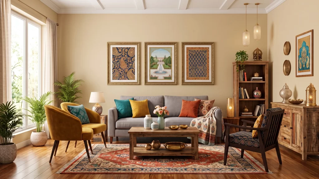
Picking the right wall colour combinations for living room walls is one of those small decisions that quietly changes how your whole home feels. The right colour combinations for living room can make a small hall feel bigger, a dull corner feel warm, and a plain box-like room feel like something out of a magazine — and you don’t even need to spend a fortune to get there. But with hundreds of paint shades sitting on every store shelf, picking the right colour combinations for living room can feel surprisingly confusing. Should you go bold, or play it safe? Should you check vastu first? And why does the perfect shade on a paint chart somehow look completely different on your own living room wall?
That’s exactly why we built this guide. Below, you’ll find 32 hand-picked wall colour combinations for living room walls — sorted into easy categories, each with the real colour codes (so you can copy them straight to your painter or paint app), the mood each combination creates, and the kind of room it suits best. No guesswork, no confusing jargon — just a friendly, practical guide to the best wall colour combinations for living room you can actually use this weekend.
A quick note on how we put this together: every one of these wall colour combinations for living room ideas was shortlisted by looking at long-standing colour theory principles (which colours sit well together on a wheel), real interior design practices used across homes, and the very latest 2026 colour trend reports from global paint authorities. We’ve also leaned on common reader questions — the same ones real people type into Google when searching for wall colour combinations for living room — to make sure nothing important got left out.
Why Your Wall Colour Combinations for Living Room’s Walls Actually Matter
Colour isn’t just decoration — it talks to your brain before you even notice it. Walk into a room painted in deep navy and gold, and you instantly feel a sense of calm formality. Walk into one painted in bright yellow and white, and you feel awake and cheerful within seconds. This isn’t a coincidence; colour psychologists and interior designers have studied this for decades, and a few patterns hold up consistently when choosing wall colour combinations for living room:
- Cool colours (blue, green, grey) tend to calm the mind and make rooms feel more spacious — great for small or sunny living rooms.
- Warm colours (red, orange, mustard, terracotta) bring energy and cosiness — ideal for large halls or north-facing rooms that don’t get much sunlight.
- Neutrals (beige, white, taupe, grey) act as a “reset button” for the eyes, making any furniture or artwork you add later stand out beautifully.
The living room is special because it’s the one space in an home that has to do everything — host guests, double up for festivals, work as a TV lounge, and sometimes even host a quick puja. That’s exactly why your wall colour combinations for living room walls need to balance warmth, practicality, and personality all at once.
How to Choose the Right Wall Colour Combinations for Living Room
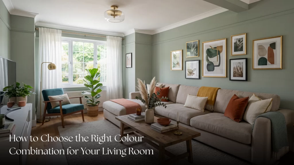
Before you jump to “the list” (don’t worry, it’s coming!), here are a few quick things worth thinking about when picking wall colour combinations for living room — the things a designer friend would actually tell you over chai, not just generic textbook advice:
- Check your natural light first. A north-facing living room that barely sees direct sun will swallow cool, dark colours and make them look flat. Warmer, lighter tones work better here.
- Look at your flooring and furniture before the wall. If you already have a dark wooden floor or a heavy brown sofa set, a very dark wall colour combination can make the room feel cramped instead of cosy.
- Think about who actually uses the room. A household with young kids or frequent guests might want a colour combination for living room walls that hides scuffs and stays timeless, rather than a trend that feels dated in two years.
- Always test a sample patch. Paint a small patch on your actual wall and check it at three times of day — morning, afternoon, and after sunset with your lights on. The same shade can look completely different at 7 PM than it does at noon.
- Don’t ignore vastu, if it matters to your family. Many households still consider vastu shastra while finalising a colour combination for living room spaces — we’ve added a full section on this further down.
What’s Trending in 2026 (And Why It’s Worth Knowing)
Here’s something most blogs on wall colour combinations for living room won’t tell you: the direction of interior trends has genuinely shifted this year, and it’s worth knowing before you commit to a colour.
In February 2026, Asian Paints announced “Moonlit Silk” as its Colour of the Year 2026 — a soft, luminous neutral described as bringing a quieter, more understated kind of beauty into everyday homes. It’s a warm, glowing neutral built around the idea of slowing down and feeling emotionally grounded in an overstimulated world. Around the same time, globally, Pantone picked “Cloud Dancer,” a soft, airy white, as its 2026 Color of the Year — and interior designers have noted that this particular white pairs especially well with natural materials like wood and stone.
What does this mean for your living room? 2026 is clearly moving away from loud, maximalist looks, and every trending combination right now leans toward soft, warm neutrals, muted greens, and calming whites — colours that feel like a deep breath rather than a statement. You’ll notice we’ve woven a few wall colour combinations for living room inspired by this exact mood into the list below, so you can stay current without going overboard.
Living Room Size Guide: Which Combinations Work Best Where
One thing most blogs skip: the size of your living room changes which combination from our list of wall colour combinations for living room actually works, no matter how trendy it looks online.
- Small or compact living rooms (under 150 sq. ft.): Stick to light, low-contrast combinations — think Scandinavian Snow, Mint Breeze, or Cloud Nine. High contrast or very dark colour combinations can visually “shrink” the walls and make a small living room feel boxed in.
- Medium living rooms (150–300 sq. ft.): This is where you have the most freedom. A two-colour combination for living room walls — one neutral base with a single bold accent wall — works beautifully here. Try Mumbai Skyline or Quiet Luxury.
- Large halls or duplex living rooms (300 sq. ft. and above): Bigger spaces can comfortably absorb darker, richer combinations without feeling heavy. This is exactly where Midnight Velvet, Emerald Drama, or Rajwada Royal really shine.
- Open-plan living + dining rooms: Keep one consistent base colour running through both spaces, and use the accent colour only on one defined wall — this keeps the open layout feeling connected rather than chopped up.
Matching Your Colour Combination with Furniture & Flooring
Like any good list of wall colour combinations for living room, this guide never treats wall colour in isolation — it has to work with what’s already in the room.
- Dark wooden furniture (sheesham, teak, walnut): Pair with warm neutrals or jewel tones — Rajasthani Sunset, Kashmiri Saffron, and Wine & Walnut are built exactly for this.
- Light or white modular furniture: Almost anything works here, but cool-toned combinations like Coastal Calm or Mumbai Skyline tend to look the most contemporary.
- Marble or light-coloured flooring: Lean toward soft pastels or warm neutrals so the floor and walls don’t compete for attention — Buttercream or Sage Whisper both work well.
- Dark or patterned flooring (Italian marble, dark tiles): Keep walls in a calmer, lighter shade so the floor pattern stays the visual highlight, rather than fighting with a busy wall colour.
Which Paint Finish Should You Choose?
This part rarely gets mentioned, but it changes how any of these wall colour combinations for living room actually look once they’re on the wall:
- Matte finish: Hides minor wall imperfections well and gives a soft, premium look — ideal for darker, dramatic combinations like Forest Noir or Plum Royale.
- Satin or eggshell finish: Slightly reflective, easy to wipe clean, and great for high-traffic living rooms with kids or frequent guests.
- Glossy or metallic finish: Works beautifully as an accent on a single feature wall (especially with gold or brass accents), but can feel overwhelming across an entire room.
As a simple rule: the bolder your colour combination for living room walls is, the more a matte finish will help it feel calm rather than glaring.
Looking for an Interior Design or Build Service?
Whether you’re planning your dream home, a commercial space, or a complete turnkey project, we’re here to help bring your vision to life with thoughtful design and seamless execution.
The Big List: 32 Best Wall Colour Combinations for Living Room
We’ve split these wall colour combinations for living room ideas into four easy categories — so wherever your taste lies (minimal, traditional, soft, or bold), you’ve got a full set of 8 options to choose from, not just one or two token ideas.
Category 1: Modern & Minimalist Wall Colour Combinations for Living Room
Clean lines, calm energy, and that “Pinterest apartment” look — these work beautifully in city apartments and compact living rooms. If you scroll through any modern interior design page today, you’ll notice almost every one of these shades showing up — that’s because minimal colour combinations photograph well, age well, and rarely go out of style.

Combo Name: Urban Concrete
Primary Colour: Cement Grey #A8A8A0
Accent Colour: Charcoal Black #2B2B2B
The Feeling: Sleek, industrial, calm
Best For: Bachelor pads, studio apartments

Combo Name: Scandinavian Snow
Primary Colour: Off-White #F5F3EF
Accent Colour: Soft Grey #D6D2C4
The Feeling: Airy, clean, spacious
Best For: Small halls, north-facing rooms

Combo Name: Mumbai Skyline
Primary Colour: Slate Blue #5C6B73
Accent Colour: Pure White #FFFFFF
The Feeling: Calm, contemporary
Best For: City apartments, balconies-attached halls
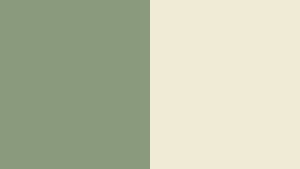
Combo Name: Quiet Luxury
Primary Colour: Warm Sage #8A9A7E
Accent Colour: Cream #F2EAD3
The Feeling: Grounded, slow-living
Best For: Anyone chasing the 2026 trend
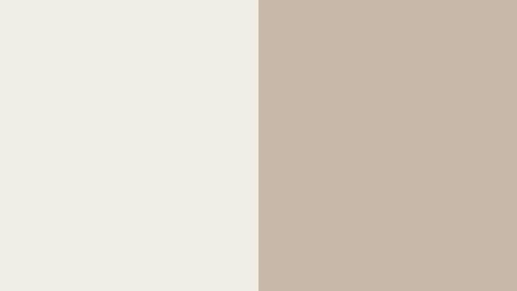
Combo Name: Cloud Nine
Primary Colour: Cloud White #F1EDE4
Accent Colour: Warm Taupe #C9B8A8
The Feeling: Serene, fresh-start feel
Best For: Rented homes, small flats

Combo Name: Monochrome Edit
Primary Colour: Light Grey #E4E4E4
Accent Colour: Deep Charcoal #36454F
The Feeling: Bold yet balanced
Best For: Feature-wall lovers

Combo Name: Soft Industrial
Primary Colour: Warm Greige #BBB6A9
Accent Colour: Matte Black #1C1C1C
The Feeling: Edgy but minimal
Best For: Loft-style homes

Combo Name: Coastal Calm
Primary Colour: Powder Blue #AFC8D0
Accent Colour: Soft White #FAFAFA
The Feeling: Breezy, fresh
Best For: Sea-facing or sunny homes
Category 2: Traditional & Festive Wall Colour Combinations for Living Room
These wall colour combinations for living room carry the warmth of weddings, festivals, and joint-family halls — names you’ll instantly recognise and relate to. Notice how every combination here leans on one warm, rich colour and one metallic or cream accent — that pairing is what gives interiors their signature festive warmth, whether it’s Diwali decorations or everyday living.

Combo Name: Rajwada Royal
Primary Colour: Deep Maroon #7B1E3A
Accent Colour: Antique Gold #D4AF37
The Feeling: Regal, festive
Best For: Large halls, joint families
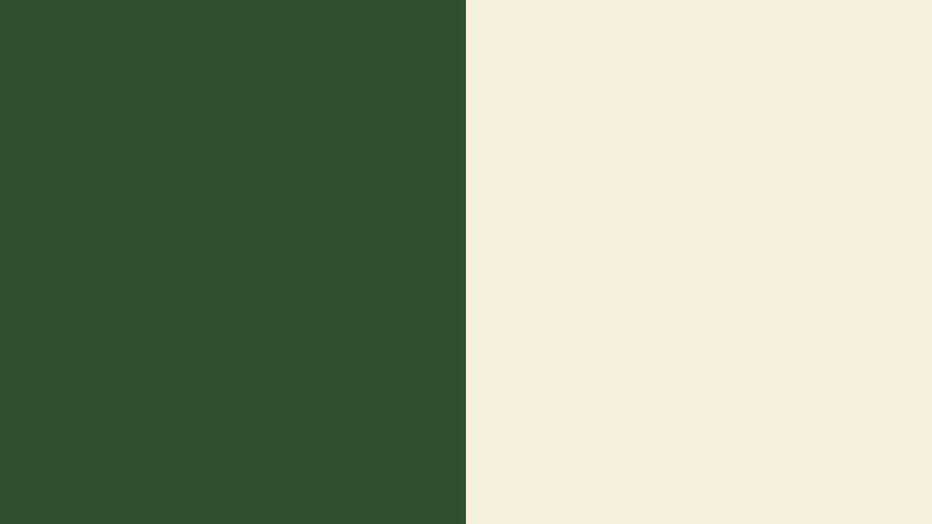
Combo Name: Kerala Backwaters
Primary Colour: Deep Green #2F4F2F
Accent Colour: Warm Cream #F5EEDC
The Feeling: Earthy, calm
Best For: Traditional or Kerala-style homes

Combo Name: Banarasi Silk
Primary Colour: Deep Red #8B0000
Accent Colour: Mustard #D8A92B
The Feeling: Festive, warm
Best For: Homes that host frequent pujas
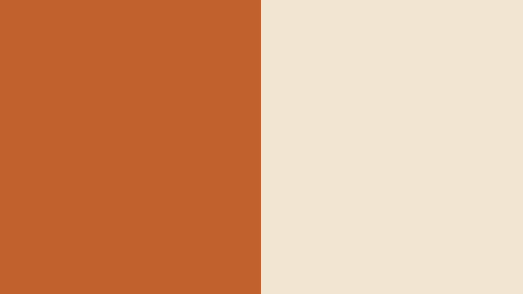
Combo Name: Rajasthani Sunset
Primary Colour: Terracotta #C1622D
Accent Colour: Cream #F3E5D0
The Feeling: Warm, welcoming
Best For: Living rooms with wooden furniture

Combo Name: Mysore Palace
Primary Colour: Royal Blue #1B3A6B
Accent Colour: Antique Gold #D4AF37
The Feeling: Grand, regal
Best For: Large drawing rooms

Combo Name: Madhubani Art
Primary Colour: Indigo #2C3E66
Accent Colour: Off-White #F5F0E1
The Feeling: Artistic, cultura
Best For: Homes with handicraft décor

Combo Name: Diwali Diya
Primary Colour: Warm Orange #E2711D
Accent Colour: Soft Cream #FDF6EC
The Feeling: Festive, cosy
Best For: Homes that love a warm welcome

Combo Name: Kashmiri Saffron
Primary Colour: Saffron #F4A100
Accent Colour: Walnut Brown #5C4033
The Feeling: Rich, warm
Best For: North-facing traditional homes
Category 3: Pastel & Soft Romantic Wall Colour Combinations for Living Room
Gentle, calming, and forgiving of small spaces — these are the safest bets if you want a wall colour combinations for living room that feels light and stress-free. They’re also the most beginner-friendly category here — pastels rarely clash with existing furniture, which makes this the easiest category to pick from if you’re painting for the very first time.

Combo Name: Morning Mist
Primary Colour: Pale Lavender #E6E0F0
Accent Colour: White #FFFFFF
The Feeling: Dreamy, calm
Best For: Small living rooms

Combo Name: Peach Sorbet
Primary Colour: Soft Peach #F4D8C8
Accent Colour: Ivory #FFF8F0
The Feeling: Warm, gentle
Best For: First homes, newlywed couples
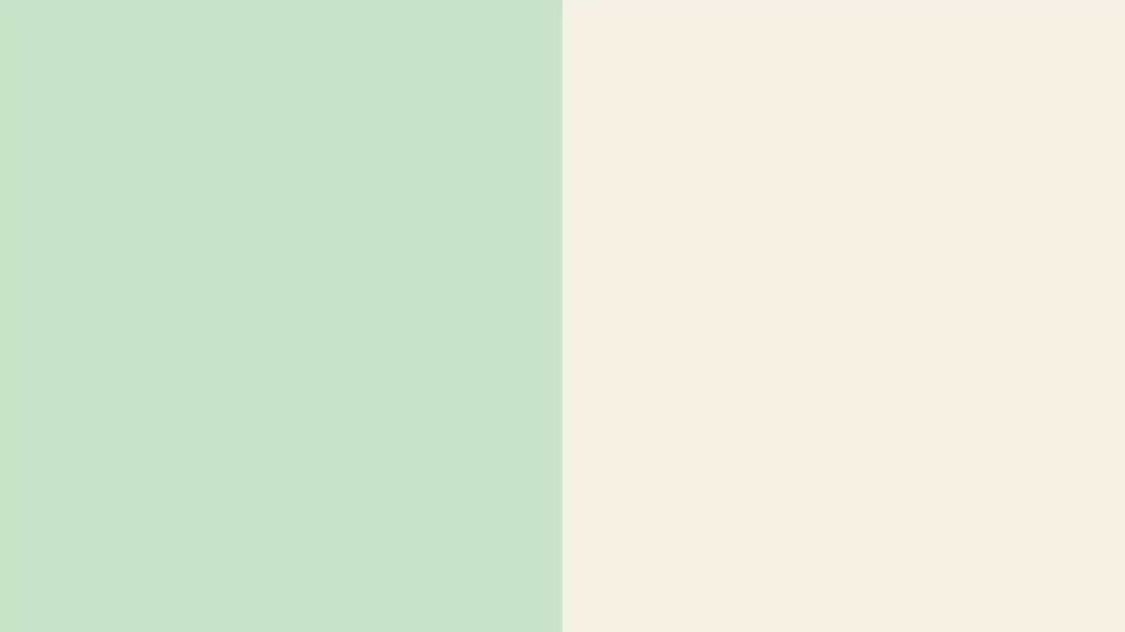
Combo Name: Mint Breeze
Primary Colour: Mint Green #C9E4CA
Accent Colour: Cream #F5F0E6
The Feeling: Fresh, light
Best For: Compact apartments

Combo Name: Baby Blue Bliss
Primary Colour: Powder Blue #CDE7F0
Accent Colour: White #FAFAFA
The Feeling: Soft, peaceful
Best For: Homes with kids
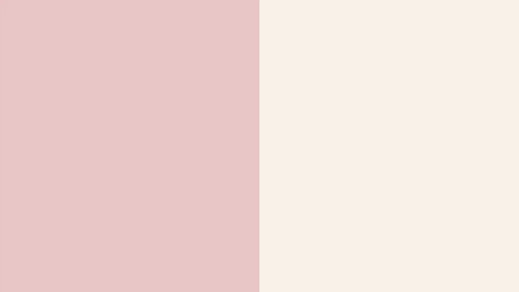
Combo Name: Blush Comfort
Primary Colour: Dusty Pink #E8C4C4
Accent Colour: Warm White #F7F1E8
The Feeling: Cosy, gentle
Best For: Reading corners, small halls

Combo Name: Lilac Calm
Primary Colour: Soft Lilac #D8CBE8
Accent Colour: Light Grey #E8E6E1
The Feeling: Soothing, modern
Best For: Apartments with limited light

Combo Name: Buttercream
Primary Colour: Pale Yellow #F2E3B3
Accent Colour: Soft White #FFFDF8
The Feeling: Cheerful, light
Best For: Low-light or rented homes
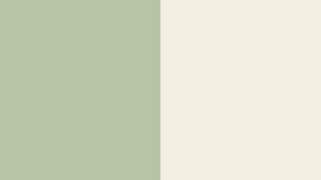
Combo Name: Sage Whisper
Primary Colour: Sage Green #B7C4A6
Accent Colour: Cream #F4EFE3
The Feeling: Grounded, calm
Best For: 2026-trend lovers on a budget
Category 4: Bold & Luxury Wall Colour Combinations for Living Room
For the living room that’s meant to make a statement — these wall colour combinations for living room pair dark, dramatic shades with rich gold or warm wood tones. These work best when you’re confident about your lighting, since darker combinations need warm, layered lighting (think floor lamps and warm-white bulbs) to feel cosy rather than cave-like.

Combo Name: Emerald Drama
Primary Colour: Emerald Green #0B6E4F
Accent Colour: Antique Gold #D4AF37
The Feeling: Luxurious, bold
Best For: Large halls with good lighting

Combo Name: Midnight Velvet
Primary Colour: Deep Navy #0B1F3A
Accent Colour: Champagne Gold #C9A66B
The Feeling: Dramatic, elegant
Best For: Formal drawing rooms
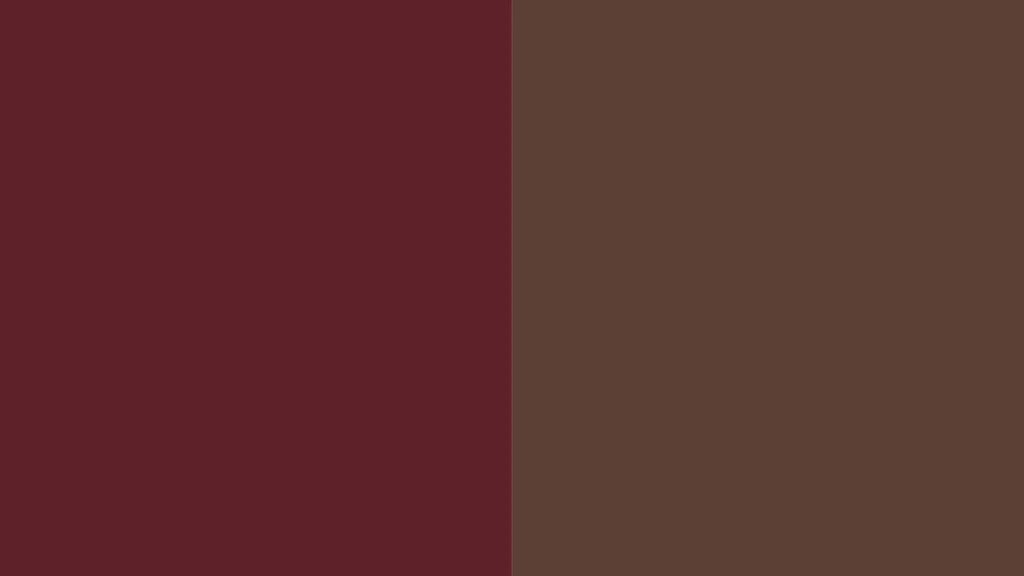
Combo Name: Wine & Walnut
Primary Colour: Wine Red #5E2129
Accent Colour: Walnut Brown #5C4033
The Feeling: Rich, intimate
Best For: Homes with wooden furniture

Combo Name: Charcoal Luxe
Primary Colour: Charcoal #2B2B2B
Accent Colour: Brass Gold #B8860B
The Feeling: Sophisticated, edgy
Best For: Modern villas, duplexes
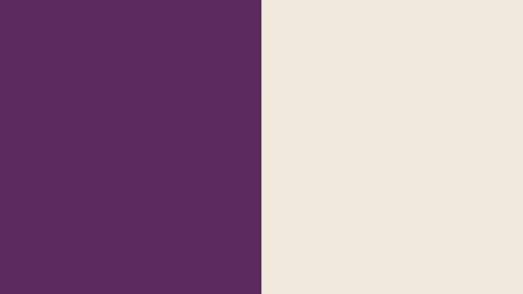
Combo Name: Plum Royale
Primary Colour: Deep Plum #5B2A5E
Accent Colour: Warm Cream #F1E9DC
The Feeling: Bold, feminine
Best For: Statement accent walls

Combo Name: Forest Noir
Primary Colour: Forest Green #1F3D2B
Accent Colour: Matte Black #101010
The Feeling: Moody, premium
Best For: Large, well-lit halls

Combo Name: Bordeaux Statement
Primary Colour: Bordeaux #6E1423
Accent Colour: Warm Beige #E5DCC3
The Feeling: Confident, rich
Best For: Single accent wall

Combo Name: Teal Opulence
Primary Colour: Deep Teal #0F4C5C
Accent Colour: Antique Gold #D4AF37
The Feeling: Striking, premium
Best For: Maximalist lovers
Bonus: Vastu-Friendly Colours for Your Living Room
A lot of our readers ask specifically about wall colour combinations for living room that also follow vastu — so here’s a quick, practical breakdown many traditional households go by:
- Light, soft colours like cream, light yellow, light green, and off-white are generally considered favourable for the living room, since they’re believed to encourage positive energy and warm conversations.
- Avoid heavy, all-dark colours like black or very deep grey across the entire room — many vastu practitioners suggest using darker tones only as accents, not the dominant colour.
- South and south-west walls are often kept in slightly deeper or warmer tones, while north and east walls are usually kept lighter to allow energy (and light) to flow in.
- This is a popular tradition many families personally follow, not a scientifically proven rule — so use it as a guideline alongside your own taste, not a strict requirement.
Common Mistakes People Make (Avoid These!)
A few honest, friend-to-friend tips before you pick up that paint brush and commit to one of these wall colour combinations for living room:
- Choosing a colour combination for living room walls from a photo alone, without checking how it looks in your room’s actual light. A combination that looks stunning in a professionally lit photoshoot can look completely different under your tube light at 9 PM.
- Forgetting the ceiling and trim — a beautiful wall colour can look unfinished next to a mismatched white ceiling. Even a simple off-white ceiling (rather than stark white) usually blends better with warm colour combinations.
- Going too dark in a small or low-light room, which can make it feel even smaller and gloomier than it actually is.
- Copying a trend blindly instead of picking something that fits your own furniture, flooring, and lifestyle. Trends change every year; your living room shouldn’t need repainting every year to keep up.
- Using too many colours at once — stick to 2–3 main colours so the eye has a place to “rest.” A living room with five different wall colours often ends up feeling chaotic rather than designed.
- Skipping the undertone check. Two whites or two greys can look identical on a chart but completely different on the wall — always check whether a shade leans warm or cool before finalising.
Frequently Asked Questions
Q1. What is the best colour combination for a living room?
There’s no single “best” among all wall colour combinations for living room — it depends on your room’s light and size. For most homes, a warm neutral combination like Quiet Luxury (sage green + cream) or Rajasthani Sunset (terracotta + cream) works beautifully across both modern and traditional décor styles.
Q2. What is a good two colour combination for living room walls?
A simple two-colour combination for living room walls — like off-white paired with a single deep accent wall in navy, maroon, or forest green — is one of the easiest ways to add personality without overwhelming the space.
Q3. What is a popular two colour combination for living rooms?
Homeowners often lean toward warm, festive pairings like maroon and gold, or terracotta and cream — colours that feel celebratory and pair well with traditional furniture and brass décor.
Q4. What’s trending for living rooms in 2026?
Soft, warm neutrals and muted greens are leading the way among 2026 wall colour combinations for living room, inspired directly by both Asian Paints’ and Pantone’s 2026 colour picks — a shift toward calm, grounding tones rather than loud, bold statements.
Q5. What’s a simple colour combination for a small living room?
Stick to light, soft shades — like Mint Breeze or Morning Mist — with one wall in a slightly deeper accent shade. This keeps the room feeling open while still adding character.
Q6. What’s a modern two colour combination for a living room?
Modern homes often go with a neutral base — grey, off-white, or beige — paired with one calm accent like slate blue or sage green. It’s the same approach used in combinations like Mumbai Skyline or Monochrome Edit, and it suits almost any furniture style.
Q7. Does the direction my living room faces affect the colour combination I should pick?
Yes, to some extent. North and east-facing rooms get gentler, indirect light, so lighter and warmer colour combinations help avoid a dull look. South and west-facing rooms get stronger, harsher light, where cooler combinations like Coastal Calm or Mint Breeze can actually feel more comfortable through the day.
Final Thoughts
Choosing the right wall colour combinations for living room doesn’t have to feel overwhelming once you break it down the right way — by your room’s light, your furniture, your family’s lifestyle, and yes, a little bit of current trend awareness. Whether you lean toward the calm minimalism of Scandinavian Snow, the festive warmth of Rajwada Royal, the soft comfort of Blush Comfort, or the bold drama of Midnight Velvet, the goal is the same: a living room that genuinely feels like you the moment you walk in.
Save the hex codes from whichever combo caught your eye, take them to your painter or paint app, and don’t skip the sample-patch step — it makes all the difference between a colour that looked nice on screen and one that actually feels right in your home. Your living room sets the tone for every guest, every festival, and every lazy Sunday afternoon that happens in it — so take your time, trust your eye, and pick the wall colour combinations for living room that feels right for the way you actually live.